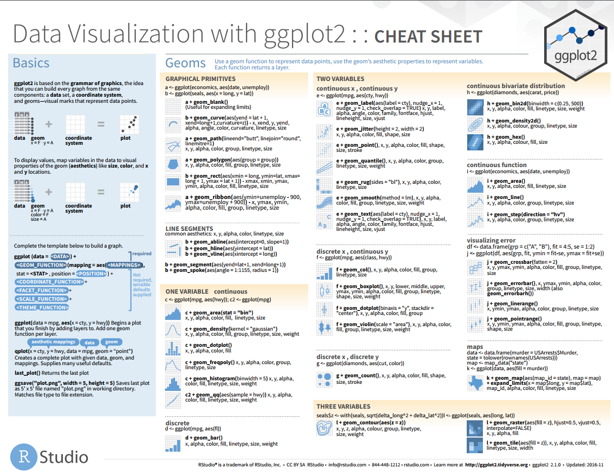
一张统计图形就是从数据到几何对象 (geometric object, 缩写为 geom, 包括点、线、条形等)的图形属性 (aesthetic attributes, 缩写为 aes, 包括颜色、形状、大小等)的一个映射。此外,图形中还可能包含数据的统计变换 (statistical transformation, 缩写为 stats), 最后绘制在某个特定的坐标系 (coordinate system, 缩写为 coord) 中,而分面 (facet, 指将绘图窗口划分为若干个子窗口)则可以用来生成数据中不同子集的图形。 两两之间通过 ggplot2 is a powerful and a flexible R package, implemented by Hadley Wickham, for producing elegant graphics. The concept behind ggplot2 divides plot into three different fundamental parts: Plot = data + Aesthetics + Geometry. The principal components of every plot can be defined as follow: There are two major functions in ggplot2 package: qplot() and ggplot() functions. 通常基础布局可以写在 ggplot 中,特有的映射信息写在特有的图层中,非动态值要写在映射的外部。如下则是一种通用的作图格式。 几何对象如果对应的多个观测值的统计结果(群组几何对象),通常需要进行分组, 有时候我们需要绘制基因的表达谱然后还需要加一条拟合单个基因表达值的线出来。这个时候其实就是在两个图层使用两个不同的分组策略。 很多图都是将不同的 group 画在不同的小图中,这种操作模式就叫做分面。主要涉及到如下两个函数。 首先是 facet_wrap(只能针对一个变量进行分面) 重要参数: facet_grid(可以针对两个变量进行非面) 与 facet_wrap 不同的参数: 统计变化其实在每一个集合对象中都是存在的,只是有些默认到我们通常并不会察觉。每种几何对象都对应一种统计变换,每种统计变换都默认对应一种集合对象,比如直方图是 bin,散点图是 identity。 ggplot 中和统计变换相关的函数 我们常用的画图方式先确定展示方式再进行统计变换,其实也可以先进行统计变换,再确定展示方式。 对待单变量数据,如果是离散性变量可以使用 双变量无统计变换 位置调整参数 什么是标度 Scales control the details of how data values are translated to visual properties. Override the default scales to tweak details like the axis labels or legend keys, or to use a completely different translation from data to aesthetic. 标度控制控制数据到图形属性的映射,将数据转换为颜色位置和大小,并且提供坐标轴和图例(引导元素)信息。 标尺函数: 支持的坐标系内容如下: 同尺度坐标系让 X 和 Y 轴比例一致, 翻转坐标系: ggplot 内置 9 个主题,其中 bw,light 和 classic 是科研常用主题。 全局设置主题: 处理设置全局的主题,还可以定制图中的某些元素,比如文本直线和矩形元素的边框颜色填充颜色 使用包 gridExtra 即可实现复杂布局。 完整的 ggplot 如下所示有 7 个参数,但是通常不需要我们全部添加进去,必须的是 data, mappings 和 geom function。 完整的画图思路如下 数据导入并进行转换 选择几何对象展示数据中的变量 选择合适的坐标系放置几何图形 参考资料 本文作者:思考问题的熊 版权声明:本博客所有文章除特别声明外,均采用 知识共享署名-非商业性使用-禁止演绎 4.0 国际许可协议 (CC BY-NC-ND 4.0) 进行许可。 如果你对这篇文章感兴趣,欢迎通过邮箱订阅我的 「熊言熊语」会员通讯,我将第一时间与你分享肿瘤生物医药领域最新行业研究进展和我的所思所学所想,点此链接即可进行免费订阅。整体介绍
要素
+以图层(layer)形式叠加。
映射
ggplot(data = <DATA>, mapping = aes(<MAPPINGS>)) +
  <GEOM_FUNCTION>(mapping = aes(<MAPPINGS>))
分组
group =会默认将绘图中使用的离散性变量为数据进行分组。p<-ggplot(data = dexp, aes(x = Sample, y = Expression))
p + geom_line(aes(group = Gene, color = Gene)) +
geom_smooth(aes(group = 1))
分面
facet_wrap 和 facet_gridfacet_wrap(facets, nrow = NULL, ncol = NULL, scales = "fixed",
shrink = TRUE, labeller = "label_value", as.table = TRUE,
switch = NULL, drop = TRUE, dir = "h", strip.position = "top")
~Group,表示用 Group 变量进行数据分面
facet_grid(facets, margins = FALSE, scales = "fixed", space = "fixed",
           shrink = TRUE, labeller = "label_value", as.table = TRUE,
           switch = NULL, drop = TRUE)
Gene ~ Group, 基因分行,group 分列##分面
p<-ggplot(data = dexp, aes(x = Sample, y = Expression))
p + geom_point() +
facet_wrap(~Gene, scales = "free_x", nrow = 5)
dexp_small<-filter(dexp, Gene %in% paste("G", 1:9, sep = ""))
ps<-ggplot(data = dexp_small, aes(x = Sample, y = Expression))
ps + geom_point(aes(color = Length)) +
facet_grid(Gene ~ Group, scales = "free", margins = T,
space = "free")
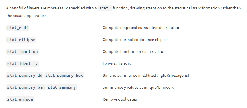
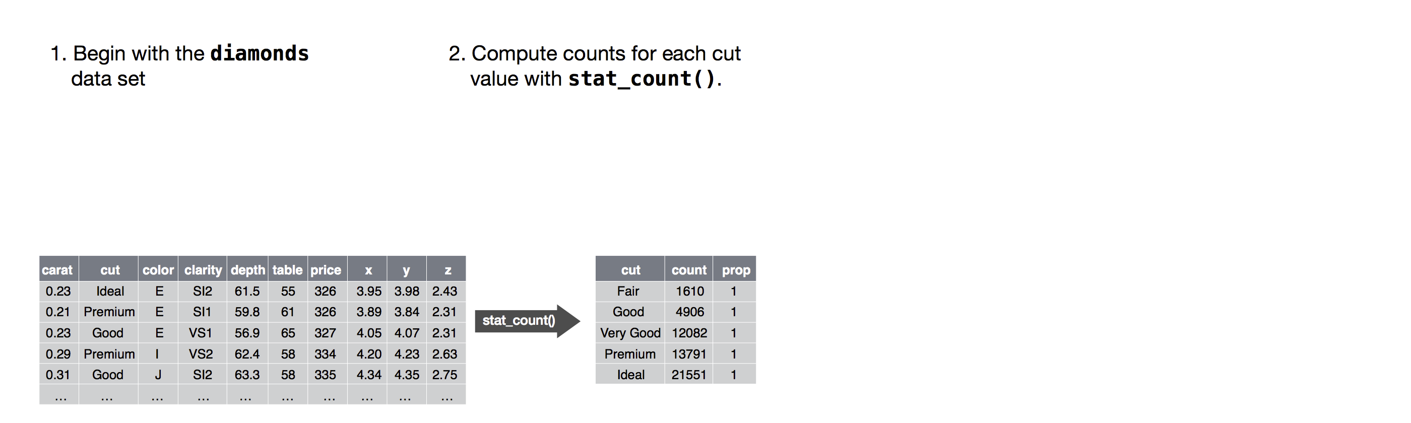
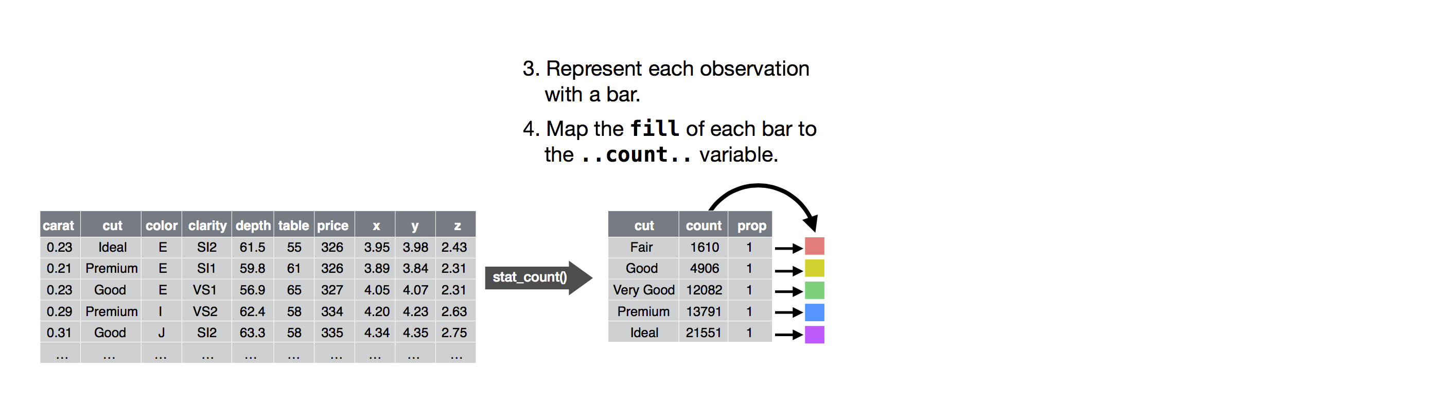
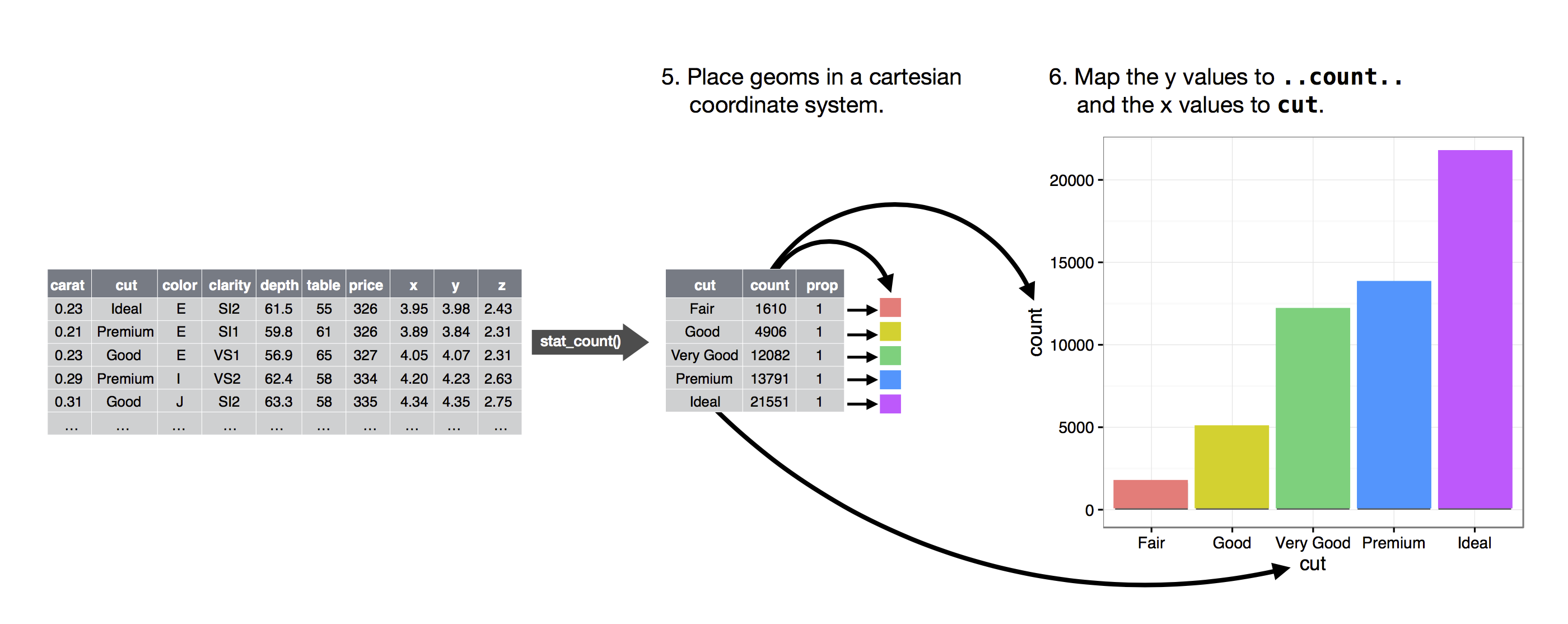
统计变换
#geom_histogram(
#  stat = "bin",     #数据的统计方式:按窗口统计
#  binwidth = NULL,  #窗口大小
#  bins = NULL,      #分成多少个窗口
#  mapping = NULL,   #y 轴是什么,数目。.count.. 密度。.density..
#)

# 以下两种方法等价

p1 + geom_histogram(binwidth = 200,aes(x = Length, y = ..count..))
p1 + stat_bin(binwidth = 200, aes(x = Length, y = ..count..))

# 我们需要展示出某个变量的某种统计特征的时候,需要用到统计变换,生成变量的名字必须用点号围起来。
stat_count 计数,如果是连续性变量可以使用 stat_bin 。常用简单图形
查看具体数据
ggplot_build()标度 scale
scale_图形属性_标尺名称
图形属性
离散型(因子、字符、逻辑值)
连续型(数值)
颜色 (color) 和 (fill) 填充
hue/brewer/grey/identity/manual
gradient/gradient2/gradientn
位置 (position)(x,y)
discrete
continuous/date
形状 (shape)
shape/identity/manual
线条类型 (line type)
linetype/identity/manual
大小 (size)
identity/manual
size
#name: 修改引导元素名称
p + scale_x_discrete(name = "Sample Name") +
  scale_y_continuous(name = "Gene Expression") +
  scale_color_hue(name = "Gene Name") +
  scale_size_continuous(name = "Gene length")

p + labs(x = "Sample Name", y = "Gene Expression",
         color = "Gene Name", size = "Gene Length")

#limits: 设定标度定义域
p + scale_x_discrete(limits = c("S1", "S3", "S5")) +
  scale_y_continuous(limits = c(0, 1500))
  scale_color_hue(limits = c("G1", "G3", "G5")) #限制颜色

# 指定取值范围和显示样本
# 下面和上面等同
p + xlim("S1", "S3", "S5")
p + ylim(0, 1500)

#breaks: 设置引导元素的刻度
limits <- p + scale_x_discrete(limits = c("S1", "S3", "S5"))
breaks <- p + scale_x_discrete(breaks = c("S1", "S3", "S5"))
# breaks 都显示但是坐标轴只显示
# limits 只显示
#grid.arrange(limits, breaks, ncol = 2)

p + scale_y_continuous(breaks = seq(0,2000, 200)) #200 换刻度
p + scale_x_discrete(labels = paste("Sample", 1:9, sep = "")) # 改标签
library(scales)
# 改变 Y 轴标签
p + scale_y_continuous(labels = scientific) #comma, percent, dollar, and scientific
坐标系
坐标系
描述
cartesian
笛卡尔坐标系
equal
同尺度笛卡尔坐标系
flip
翻转笛卡尔坐标系
trans
变换笛卡尔坐标系
polar
极坐标
map
地图投影
coord_equal(ratio = 1) 用来调整比例。coord_flip(),x 随 y 的变化趋势。标度和坐标系范围的不同
coord_cartesian(xlim = c(0, 1000), ylim = c(0, 1000))
标度设置范围:剔除范围外数据,再统计绘图
坐标系设置范围:仍使用所有数据统计变换 ,相当于对图形的局部放大。主题设置与美化
theme_set(theme_bw)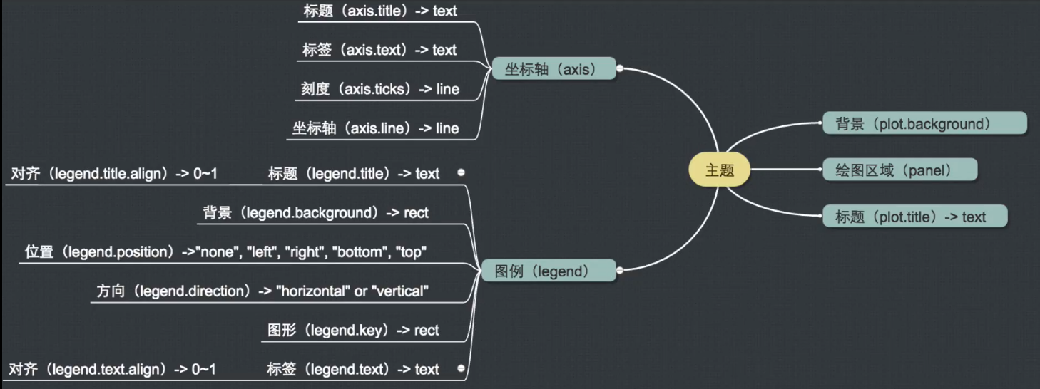
# 修改标题 大小和居中
p + labs(title = "Density distribution") +
  theme(plot.title = element_text(size = 20, hjust = 0.5))

# x 标题斜体
p + labs(x = "expression") +
    theme(axis.title = element_text(face = "italic"),
          axis.text.x =element_text(angle = 45, vjust = 0.5))

# 修改图例、
p + theme(legend.position = c(0.9,0.7),legend.background = element_rect(fill = "gray"))
一页多图
终极总结
ggplot(data = <DATA>) +
  <GEOM_FUNCTION>(
     mapping = aes(<MAPPINGS>),
     stat = <STAT>,
     position = <POSITION>
  ) +
  <COORDINATE_FUNCTION> +
  <FACET_FUNCTION>

http://ggplot2.tidyverse.org/
http://r4ds.had.co.nz/data-visualisation.html
· 分享链接 https://kaopubear.top/blog/2018-12-13-rggplot/