导入所需数据格式为 data.frame qplot() 基本用法 boxplot dotplot violin 三种方法 使用 和 box plot 类似 资料来源 http://www.sthda.com/english/wiki/ggplot2-essentials 本文作者:思考问题的熊 版权声明:本博客所有文章除特别声明外,均采用 知识共享署名-非商业性使用-禁止演绎 4.0 国际许可协议 (CC BY-NC-ND 4.0) 进行许可。 如果你对这篇文章感兴趣,欢迎通过邮箱订阅我的 「熊言熊语」会员通讯,我将第一时间与你分享肿瘤生物医药领域最新行业研究进展和我的所思所学所想,点此链接即可进行免费订阅。qplot 使用
data(mtcars)
df <- mtcars[, c("mpg", "cyl", "wt")]
head(df)
qplot(x, y=NULL, data, geom="auto",
      xlim = c(NA, NA), ylim =c(NA, NA))

# geom 画什么图;main 题目;xlab,ylab xy 轴标签
# color 颜色;size 点大小;shape 点形状
Scatter plots 散点图
library(ggplot2)
# 基本款
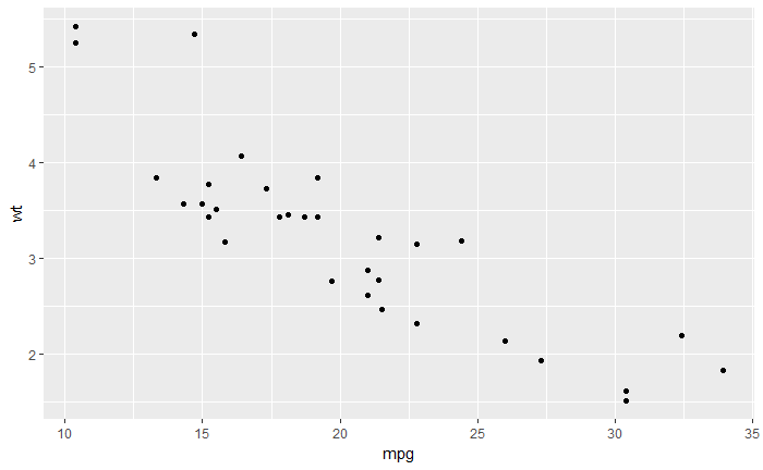
qplot(mpg, wt, data=mtcars)
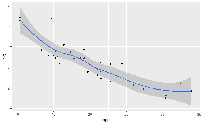
# 增加 standard error 和 smoothed line
qplot(mpg, wt, data = mtcars, geom = c("point", "smooth"))
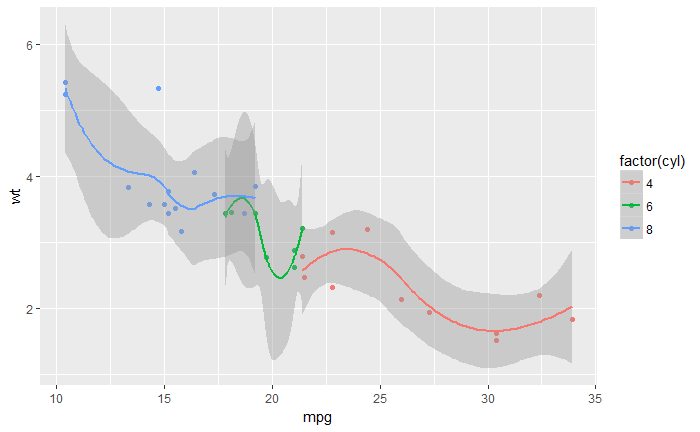
# 分组增加 smoothed line
qplot(mpg, wt, data = mtcars, color = factor(cyl),
geom=c("point", "smooth"))
boxplot violin plot
geom="boxplot"
geom="dotplot"
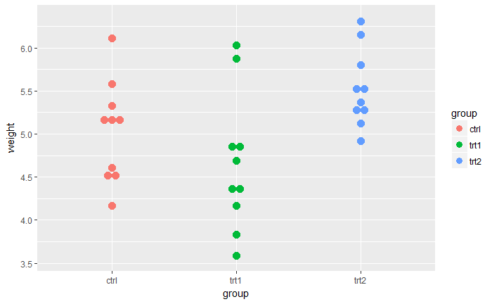
geom="violin"# Basic box plot from data frame
qplot(group, weight, data = PlantGrowth,
geom=c("boxplot"), fill = group)
# fill 填充颜色
# Dot plot
qplot(group, weight, data = PlantGrowth,
geom=c("dotplot"),
stackdir = "center", binaxis = "y",color = group, fill = group)
# Violin plot
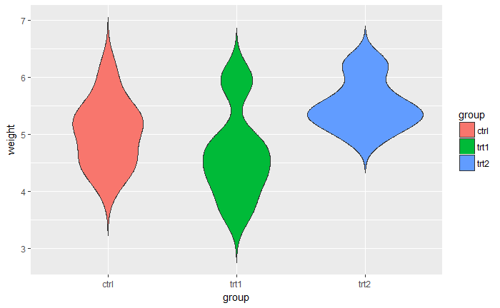
qplot(group, weight, data = PlantGrowth,
geom=c("violin"), trim = FALSE, fill = group)

histogram density plot
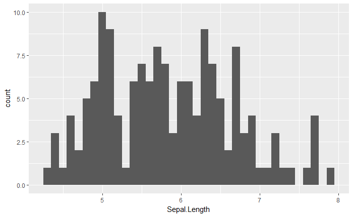
qplot(Sepal.Length, data = iris, geom = "histogram", binwidth=0.1)
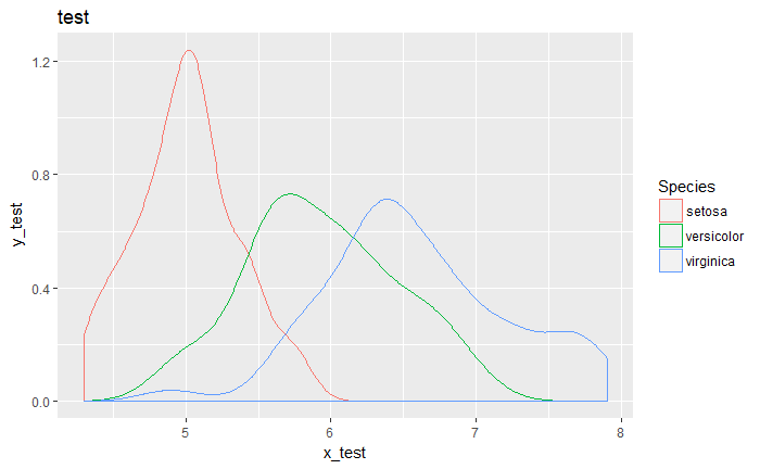
qplot(Sepal.Length, data = iris, geom = "density", color = Species,
main = "test", xlab = "x_test", ylab = "y_test")
ggplot2 box plot
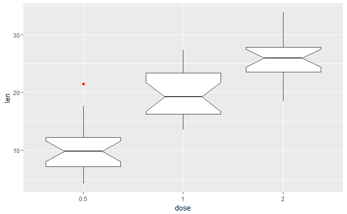
ToothGrowth$dose <- as.factor(ToothGrowth$dose)
# notched box plot
ggplot(ToothGrowth, aes(x=dose, y=len)) +
  geom_boxplot(notch=TRUE, outlier.color = "red")
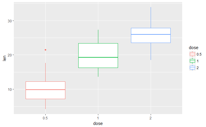
改变线颜色
p<-ggplot(ToothGrowth, aes(x=dose, y=len, color=dose)) +
  geom_boxplot()
p
p+scale_color_manual(values=c("#999999", "#E69F00", "#56B4E9"))
p+scale_color_brewer(palette="Dark2")
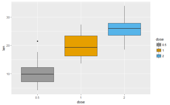
改变箱颜色
p<-ggplot(ToothGrowth, aes(x=dose, y=len, fill=dose)) +
  geom_boxplot()
p
# Use custom color palettes
p+scale_fill_manual(values=c("#999999", "#E69F00", "#56B4E9"))
# use brewer color palettes
p+scale_fill_brewer(palette="Dark2")

# 改变横坐标展示顺序
p + scale_x_discrete(limits=c("2", "0.5", "1"))
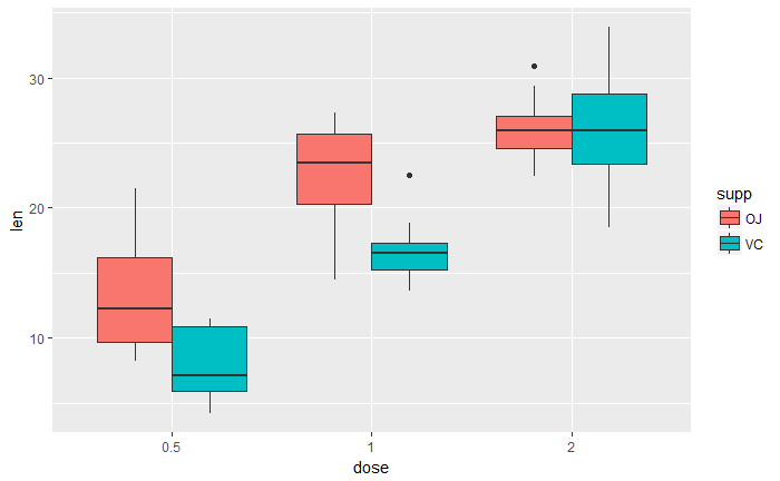
多组展示
ggplot(ToothGrowth, aes(x=dose, y=len, fill=supp)) +
  geom_boxplot()
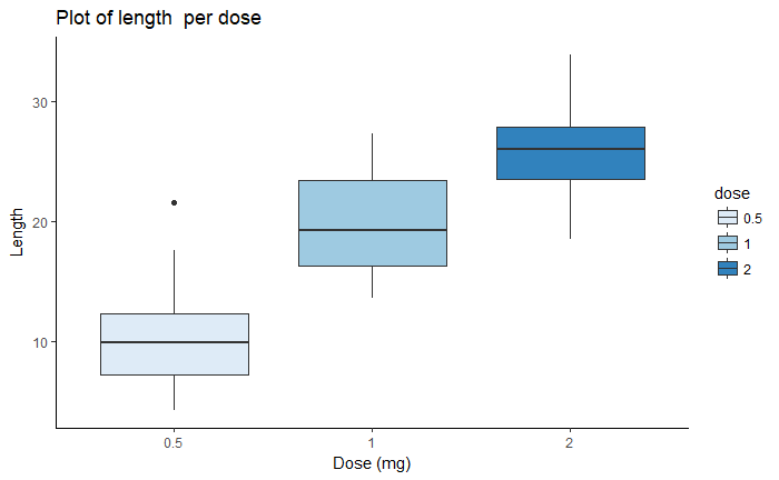
定制
bp <- ggplot(ToothGrowth, aes(x=dose, y=len, fill=dose)) +
  geom_boxplot()+
  labs(title="Plot of length  per dose",x="Dose (mg)", y = "Length")
bp + theme_classic()
bp + scale_fill_brewer(palette="Blues") + theme_classic()
bp + scale_fill_brewer(palette="Dark2") + theme_minimal()
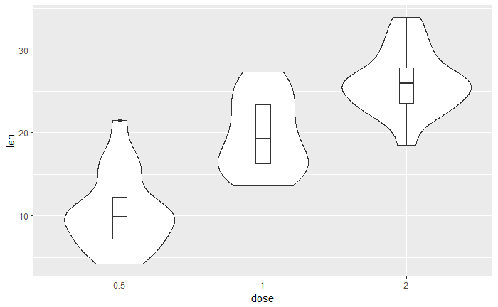
violin plots
ToothGrowth$dose <- as.factor(ToothGrowth$dose)

# trim
p <- ggplot(ToothGrowth, aes(x=dose, y=len)) +
  geom_violin()
p
# no trim
p2<-ggplot(ToothGrowth, aes(x=dose, y=len)) +
  geom_violin(trim=FALSE)
p2
显示范围
# 显示范围
p + scale_x_discrete(limits=c("0.5", "2"))
添加描述统计量
stat_summary()# violin plot with mean points
p + stat_summary(fun.y=mean, geom="point", shape=23, size=2)
# 加箱线图
p + geom_boxplot(width=0.1)
修改颜色
p<-ggplot(ToothGrowth, aes(x=dose, y=len, color=dose)) +
  geom_violin(trim=FALSE)
p
# Use custom color palettes
p+scale_color_manual(values=c("#999999", "#E69F00", "#56B4E9"))
# Use brewer color palettes
p+scale_color_brewer(palette="Dark2")
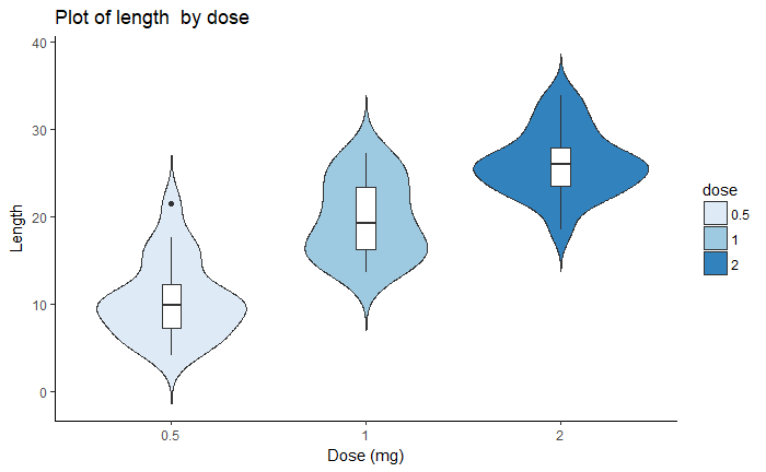
定制
dp <- ggplot(ToothGrowth, aes(x=dose, y=len, fill=dose)) +
  geom_violin(trim=FALSE)+
  geom_boxplot(width=0.1, fill="white")+
  labs(title="Plot of length  by dose",x="Dose (mg)", y = "Length")
dp
dp + scale_fill_brewer(palette="Blues") + theme_classic()
histogram 直方图
基础
#构造数据
set.seed(1234)
df <- data.frame(
sex=factor(rep(c("F", "M"), each=200)),
weight=round(c(rnorm(200, mean=55, sd=5), rnorm(200, mean=65, sd=5)))
)
# 基础
ggplot(df, aes(x=weight)) + geom_histogram()
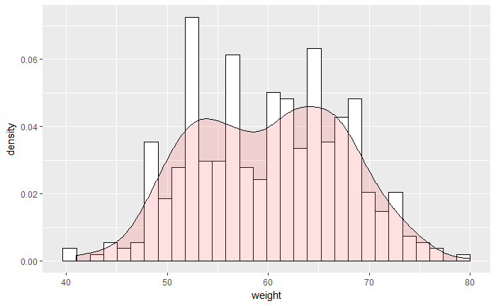
# 加 density
ggplot(df, aes(x=weight)) +
geom_histogram(aes(y=..density..), colour="black", fill="white")+
geom_density(alpha=.2, fill="#FF6666")
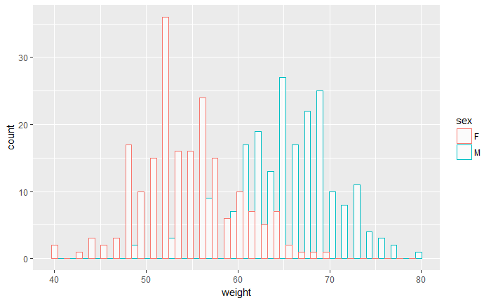
修改颜色并分组
# Change histogram plot line colors by groups
ggplot(df, aes(x=weight, color=sex)) +
geom_histogram(fill="white")
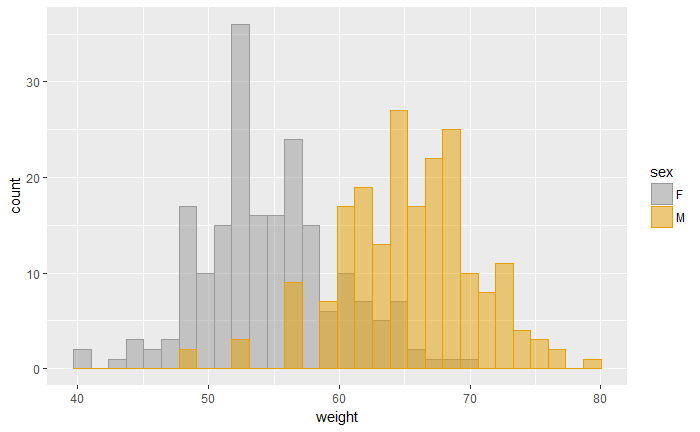
# Overlaid histograms
ggplot(df, aes(x=weight, color=sex)) +
geom_histogram(fill="white", alpha=0.7, position="identity")
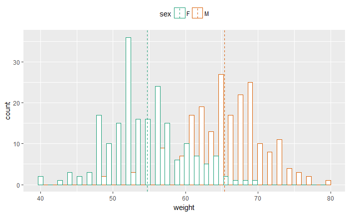
ggplot(df, aes(x=weight, color=sex)) +
geom_histogram(fill="white", alpha=.7, position="dodge")
library(plyr)
mu <- ddply(df, "sex", summarise, grp.mean=mean(weight))
p<-ggplot(df, aes(x=weight, color=sex)) +
  geom_histogram(fill="white", position="dodge")+
  geom_vline(data=mu, aes(xintercept=grp.mean, color=sex),
             linetype="dashed")+
  theme(legend.position="top")
p
# Use custom color palettes
p+scale_color_manual(values=c("#999999", "#E69F00", "#56B4E9"))
# Use brewer color palettes
p+scale_color_brewer(palette="Dark2")
填充
# Use semi-transparent fill
p<-ggplot(df, aes(x=weight, fill=sex, color=sex)) +
  geom_histogram(position="identity", alpha=0.5)
p
p+scale_color_manual(values=c("#999999", "#E69F00", "#56B4E9"))+
  scale_fill_manual(values=c("#999999", "#E69F00", "#56B4E9"))
定制
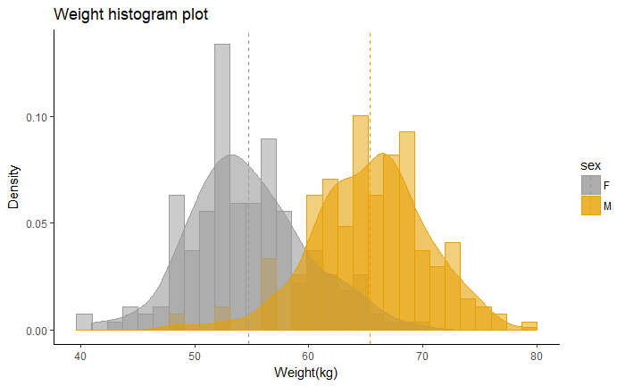
ggplot(df, aes(x=weight, color=sex, fill=sex)) +
geom_histogram(aes(y=..density..), position="identity", alpha=0.5)+
geom_density(alpha=0.6)+
geom_vline(data=mu, aes(xintercept=grp.mean, color=sex),
           linetype="dashed")+
scale_color_manual(values=c("#999999", "#E69F00", "#56B4E9"))+
scale_fill_manual(values=c("#999999", "#E69F00", "#56B4E9"))+
labs(title="Weight histogram plot",x="Weight(kg)", y = "Density")+
theme_classic()
desnsity plot
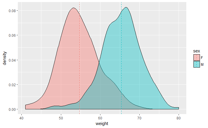
p<-ggplot(df, aes(x=weight, fill=sex)) +
  geom_density(alpha=0.4)
p
# Add mean lines
p+geom_vline(data=mu, aes(xintercept=grp.mean, color=sex),
             linetype="dashed")
scatter plots
mtcars$cyl <- as.factor(mtcars$cyl)
# Change the point size
ggplot(mtcars, aes(x=wt, y=mpg)) +
geom_point(aes(size=qsec))
# Add the regression line
ggplot(mtcars, aes(x=wt, y=mpg)) +
geom_point()+
geom_smooth(method=lm)
# Remove the confidence interval
ggplot(mtcars, aes(x=wt, y=mpg)) +
geom_point()+
geom_smooth(method=lm, se=FALSE)
# Loess method
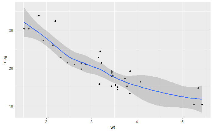
ggplot(mtcars, aes(x=wt, y=mpg)) +
geom_point()+
geom_smooth()
添加 Error bar
#+++++++++++++++++++++++++
# Function to calculate the mean and the standard deviation
# for each group
#+++++++++++++++++++++++++
# data : a data frame
# varname : the name of a column containing the variable
#to be summariezed
# groupnames : vector of column names to be used as
# grouping variables
data_summary <- function(data, varname, groupnames){
require(plyr)
summary_func <- function(x, col){
c(mean = mean(x[[col]], na.rm=TRUE),
sd = sd(x[[col]], na.rm=TRUE))
}
data_sum<-ddply(data, groupnames, .fun=summary_func,
varname)
data_sum <- rename(data_sum, c("mean" = varname))
return(data_sum)
}
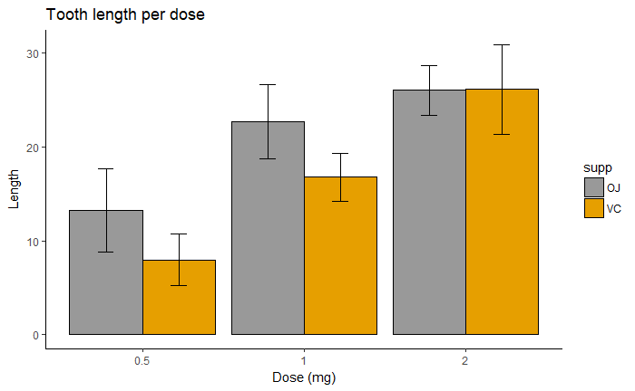
df2 <- data_summary(ToothGrowth, varname="len",
groupnames=c("supp", "dose"))
# Convert dose to a factor variable
df2$dose=as.factor(df2$dose)
library(ggplot2)
# Default bar plot
p<- ggplot(df2, aes(x=dose, y=len, fill=supp)) +
geom_bar(stat="identity", color="black",
position=position_dodge()) +
geom_errorbar(aes(ymin=len-sd, ymax=len+sd), width=.2,
position=position_dodge(.9))
print(p)
# Finished bar plot
p+labs(title="Tooth length per dose", x="Dose (mg)", y = "Length")+
theme_classic() +
scale_fill_manual(values=c('#999999','#E69F00'))
# Default line plot
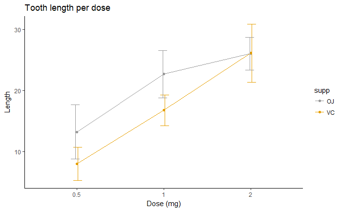
p<- ggplot(df2, aes(x=dose, y=len, group=supp, color=supp)) +
geom_line() +
geom_point()+
geom_errorbar(aes(ymin=len-sd, ymax=len+sd), width=.2,
position=position_dodge(0.05))
print(p)
# Finished line plot
p+labs(title="Tooth length per dose", x="Dose (mg)", y = "Length")+
theme_classic() +
scale_color_manual(values=c('#999999','#E69F00'))
· 分享链接 https://kaopubear.top/blog/2018-12-14-rggplotexample/